


Optimizing eBook Details
B2C | eCommerce | Q4 2024 | Research & design
With an outdated product details page and a large opportunity to convert new users into Kobo customers. I redesigned the page to make it easier for users to find relevant information. Leveraging in-depth user insights, I proposed a new approach to the information architecture for product details pages, influencing stakeholders toward a new direction that increased conversion by 4.4%.
A sneak peek of the outcome…
Meet the Team

Problem
Problem statement
We weren’t doing a good job highlighting the relevant information users needed to feel confident in purchasing.
Users
Signed-in and anonymous users were experiencing difficulty finding the relevant information they needed to build trust and make a purchasing decision
Kobo
Wanted to rebuild the product pages using new components to improve page load speed and modernize the design to better appeal to new users.
After collecting extensive user feedback my product manager agreed to go further and try improve the information architecture as well as the look and feel.
Constraints & Opportunities
Constraints
Technical
This was an entirely new page that had to be built using design system components, which meant I also had to coordinate with the platform UI team to design and pitch several new components.
Contextual
These pages had to work well for a variety of user types, and we had to find a way to accommodate the needs of signed-in and anonymous users especially since that segment presented the largest opportunity for growth.
Opportunities
Signed-in Users
May already know about Kobo, but they also want to understand how to read, and which platform is the best fit for them to start their reading journey before the can feel confident in reading
Anonymous Users
Come from organic search, and other sources where they may not have heard of us. They need to understand ‘Why Kobo’. Why eReading’, and Why this book’ before having confidence in registering and purchasing.
How might we…
Restructure information to make it easier for user to find answers to questions and increase their confidence for purchasing decisions
Defining Success
How We Defined Success
For users
Significantly reduce instances of users describing the page as “old”, “confusing”, or “full of irrelevant information”.
For Kobo
See increased page load speed, and increased conversions, especially for anonymous users that make up the majority of page sessions.
My Design Process
Working closely with product and the design system team
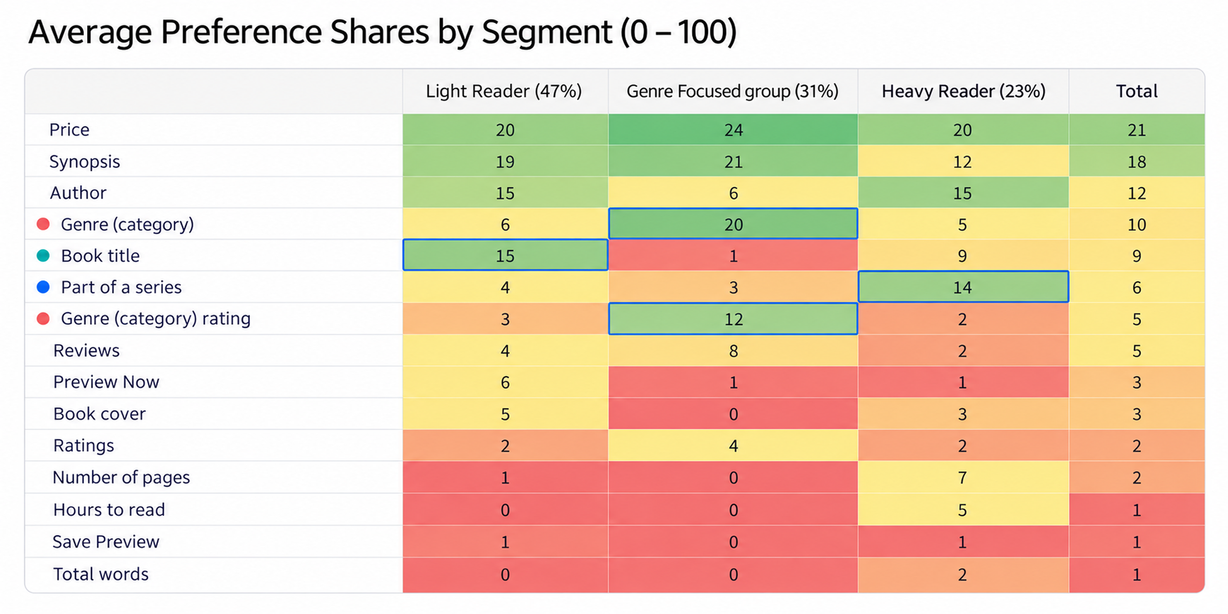
I worked closely with my product manager and the design system team to identify the primary ‘jobs to be done’ for users and learn about the information we needed to prioritize. Based on the insights we collected from using the card sorting method to rank information, we created a chart to map each archetypes preferences for information on the item details page.
This helped us to get a sense of where to focus and which areas of the page we should prioritize for signed-in and anonymous users.
Initial Brainstorm
I used the “Jobs to be done” framework to add structure to how we tackled the problem and establish a hierarchy from requirements.
Conclusion
Research and user interviews helped us uncover how users prioritized information depending on how they consumed content. We also learned about what anonymous users wanted to know about Kobo before they felt comfortable purchasing.
One main takeway was a consistent theme of users describing the page as “cluttered and clunky looking” with a lot of irrelevant information despite our chart showing evidence to the contrary.
Exploration
Rough Concepts
I used wireframes to quickly express the ideas I had for restructuring and used them to facilitate discussions with the product manager. This led to us breaking the page up into smaller chunks and testing key changes separately to validate each variable independently.
Core issue
Book details
Users described the information in this area as clunky looking, and expressed a feeling that there’s too much irrelevant information despite simultaneously ranking that type of information as important to them.
Core issue
Marketing + Reviews
Users often mentioned that this area in particular was irrelevant to them when browsing book details. However we had purchasing data that strongly suggested otherwise. The conclusion I came to was that it’s likely to be more relevant to users who have already finished reading the book as people often mentioned anchoring book discovery to titles they already know and enjoyed reading.
Core issue
Column Layout
During competitive research, I found that many core competitors adopted a 2 column approach to structuring information. However, there was the exception of Amazon [Our largest competitor].
The product team felt strongly about maintaining this structure due to it’s ability to highlight a large amount of information above the fold. But I felt that user insights were signalling against this layout.
“The large amount of information could be contributing to why users find the page to be clunky looking with irrelevant information.”
Designs & Conclusion
Conclusion
The core problems with the original design were a combination of a lack of information and simultaneously too much information at once. Based on feedback I collected from users I believed that the product details pages could benefit from a reduction in visual complexity and the use of clear labeling to help users quickly scan and locate the the information they were most interested in.
This, along with the addition of a new component underneath the buy-pad contributed to a 4.4% increase in conversions.
Takeaways
Main Takeaways
It’s important to always be open to starting a dialogue with the product team to understand what informs their opinions. This is essential to fostering an open and collaborative environment where alternative approaches are more likely to be considered
Taking time to spot the gaps or inconstancies in what users say can be pivotal to finding ideal solutions. In the case of this project. Users said they felt like there was too much irrelevant information on the page, but what they really meant was that they had trouble digesting the information on the page due to it’s visual complexity. Their thought on how to fix that was to try removing information that wasn’t relevant to them. However, by focusing on improving information hierarchy, I was able to reduce the perceived visual complexity while adding even more helpful information.